How to Test Paint Colors on Your Wall Before Buying a Gallon
The short answer: yes, you can see any paint color on your actual wall before buying a gallon. Upload a photo of your room to RoomLab.app's wall color tool, pick a shade from the palette or describe it in plain language, and the AI renders it on your walls in under a minute. In 2023, a Slickdeals and OnePoll survey of 2,000 homeowners found that 69% were embarrassed to invite people over because of their aesthetic choices, and 75% said their past decisions aged poorly (Slickdeals/OnePoll 2023, n=2,000). Most of that regret started with a paint chip picked under fluorescent store lighting. Testing a color on your actual wall, in your actual light, solves the problem before you spend a cent.
This guide covers every method for testing paint colors before you commit, from physical sample pots to AI previewing on a photo of your specific room. If you want to skip to the fastest approach, the step-by-step is in the third section.
Key takeaways
- Paint color regret is widespread: in 2023, 15% of homeowners specifically regretted their paint color, and 69% were embarrassed by their overall aesthetic choices (Slickdeals/OnePoll 2023). Testing before buying prevents this.
- Paint chips and store swatches mislead: the small size, different finish, and store lighting make a chip look nothing like the same color spread across four full walls in your home's light.
- AI previewing works on your actual room photo: upload a photo to RoomLab.app and see any color on your specific walls, with your furniture and your natural light, before spending anything.
- Physical sample pots are the best offline method: a large painted swatch on the actual wall beats a chip, but still can't match the speed and flexibility of digital previewing across a full shortlist.
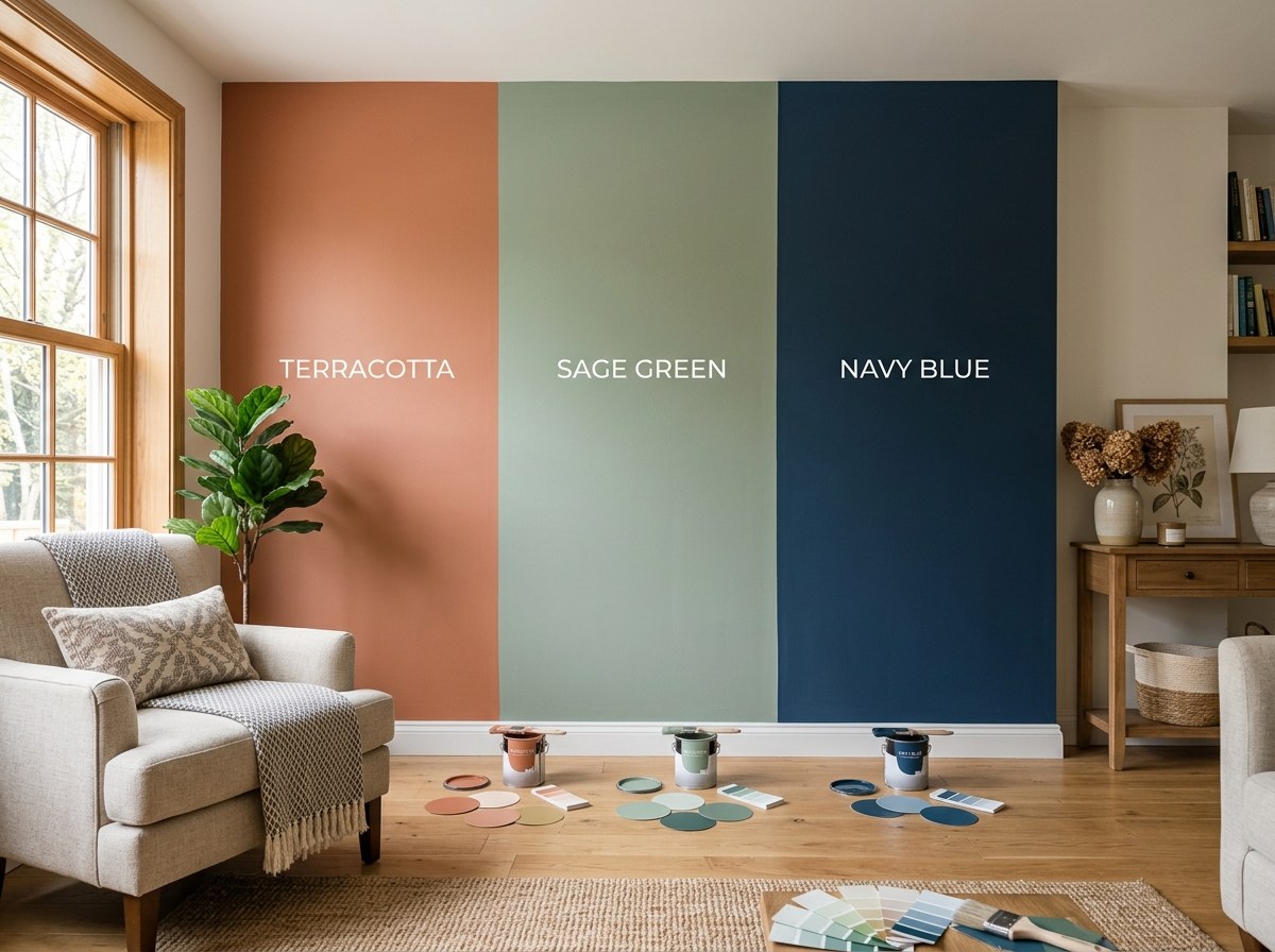
Why do so many homeowners regret their paint color?
In 2023, the Slickdeals and OnePoll survey (n=2,000) found that 15% of homeowners specifically named paint color as a regret, and 75% said their past aesthetic decisions aged poorly (Slickdeals/OnePoll 2023). The root cause is almost always the same: the color looked right on a chip or in a photo, then landed wrong on four full walls in natural light.
Paint chips create several illusions at once. The chip is a few square inches; a painted wall covers hundreds of square feet. Color appears darker and more saturated at large scale, a well-documented effect of simultaneous contrast. Store lighting is neutral and often cool, while your home may have warm incandescent bulbs, bright south-facing windows, or dim north-facing ones. The finish on the chip (usually flat) rarely matches the eggshell or satin you'll actually apply. By the time a gallon is rolled out and dry, the gap between expectation and reality can be jarring.
Physical sample pots help, but painting a 12-by-12-inch square on one wall is still a crude preview. The surrounding colors, your furniture, your rugs, and the light direction all shift how a color reads in practice. If you want to know what a color will look like in your room, the only reliable method is to see it in your room, at scale, in context.
What are your options for testing a paint color before you buy?
There are four main approaches, each with real trade-offs. Knowing what each one can and can't do helps you pick the right tool depending on how confident you need to be before committing to a gallon.
Paint chips from the store
Free, convenient, and consistently misleading for the reasons described above. Chips are useful for eliminating obvious mismatches (too blue, too warm, clearly the wrong family), but they can't tell you how a color behaves at scale in your specific room. Treat them as a first filter, not a final answer.
Peel-and-stick sample cards
Several paint brands sell large, repositionable sample squares printed in the actual paint formula. You can stick them on different walls, move them around, and observe over a day or two in different light. Better than chips. Still limited in size relative to a full wall, and you're paying a few dollars per color tested with no flexibility to quickly try a dozen shades.
Sample pots painted on the wall
The traditional offline standard: buy a small sample pot (usually $5 to $8), paint a large swatch directly on the wall, and observe it in different light throughout the day. It's a solid approach. The limitation: you can test only one or two colors at a time, the swatch still shows through the surrounding untouched walls, and comparing three finalists side by side requires multiple pots, considerable mess, and several days of observation.
AI color previewing on a room photo
The fastest and most flexible method. Upload a photo of your actual room, choose a color, and see it rendered on your walls in seconds. You can test a dozen colors in the time it takes to open one sample pot. The AI preserves your furniture, your trim, your windows, and your floor, so the preview shows the color in full context, not on a blank swatch. For most homeowners, this replaces the sample pot stage for every color except the final finalist.
How do you test paint colors on your actual wall using RoomLab.app?
The full process takes about two minutes for the first color and under a minute for each one after that. Here's the exact workflow from photo to confident decision.
Step 1: Photograph the room
Shoot during the day with natural light. Open all the blinds fully and turn the overhead light off if possible. Stand in a corner so both side walls appear in the frame, and hold the phone at mid-wall height rather than angling up or down. A smartphone photo is fine. What matters is that the walls, floor, trim, and main furniture pieces are all visible, since the AI uses the room's full context when it renders the new color.
Step 2: Upload and select the wall colors feature
Open RoomLab.app's wall color tool and upload your photo. The AI detects the wall area automatically, or you can select it manually. Then pick a color from the palette, paste a hex code, or describe the color you want in plain language: "warm sage green", "deep navy with a slight gray undertone", "the color of unbleached linen". All three input methods work.
Step 3: Generate and compare colors side by side
The preview renders in under a minute. You can generate multiple color options in sequence and download them for side-by-side comparison. If you're deciding between three finalists, run all three and set the images next to each other on screen. You'll see how each one interacts with your existing furniture, trim color, and flooring, which is exactly the information a chip cannot give you. This is the point where most homeowners narrow from eight options to two.
Step 4: Buy one sample pot for the winner
Even after a strong AI preview, a physical sample pot on the actual wall is a useful final check, especially for colors with tricky undertones: warm grays that can read pink, cool whites that shift blue, yellows that flatten in north-facing rooms. The digital preview narrows your shortlist from many colors to one or two. The physical sample confirms the finalist. You buy one pot instead of five or six, and you already know the color works before you commit to a gallon.
For a broader look at how AI visualization helps with renovation decisions beyond paint, see our complete guide to visualizing a renovation before you start.
Which paint colors do homeowners regret most?
In 2023, Slickdeals and OnePoll asked 2,000 homeowners which specific paint colors they most regretted. Among those who named a color, avocado green topped the list at 53%, followed by eggshell white at 49% and millennial pink at 44% (Slickdeals/OnePoll 2023). Each of these colors shares a common pattern: they looked current and appealing at the time, then aged quickly as trends shifted.
What's notable about this list isn't the colors themselves. It's the pattern. All three were trend-driven choices. Avocado green had a moment in the 1970s and again briefly in the early 2000s. Millennial pink peaked in the mid-2010s and began dating quickly by 2019. Eggshell white, which might seem like a safe neutral, was over-applied as a catch-all "blank canvas" tone that now reads as generic to many homeowners.
The takeaway isn't that you should avoid these specific colors. Avocado green in the right shade and room context can look grounded and intentional. The takeaway is that any trend color should be tested in your specific room before you commit. For a deeper look at color regret patterns and which neutrals tend to hold up over time, see our guide to paint colors homeowners regret most.
What should you check when previewing a paint color on your room?
A digital preview does most of the analytical work, but knowing what to look for makes comparisons faster and more useful. Here are the four things worth examining when evaluating a color on your room photo.
Undertones in context
Warm grays can read lavender or pink when placed next to cool-toned furniture or blue-white trim. Cool whites can look stark or clinical against warm wood floors. The AI applies the color across your actual room photo, so undertones that hide on a small chip become visible in full context. If a "warm gray" reads purple in your preview, it will read purple on your walls too.
How the color interacts with your trim
The contrast between wall color and trim (baseboards, door frames, window casings, crown molding) is one of the largest visual factors in how a room feels. A wall color that reads as a clean neutral against bright white trim may look completely different next to off-white or natural wood. The room preview shows this relationship clearly because your existing trim stays visible in the photo.
Light direction
North-facing rooms get cooler, indirect light that pushes colors toward blue and gray. South-facing rooms get warm, direct light that brings out yellow and red undertones. If your room faces north, take your preview photo on a bright day to get the most realistic representation of how the color will behave in practice. The same color can look warmer or cooler depending on which wall you're viewing and what time of day it is.
The scale effect
Colors appear darker and more saturated when they cover a full room versus a small swatch. A color that looks like a soft sage on a chip may feel quite intense across four walls. The full-room preview accounts for this by showing the color at wall scale. If a color looks intense in the preview, it will likely feel even more intense in person. If it reads as slightly more muted than you expected, that's usually a good sign.
Frequently asked questions
Can I test paint colors online for free?
Yes. RoomLab.app lets you upload a photo of your room and preview wall colors at no cost in the free tier. Upload your photo, choose a color from the palette, and the AI applies it to your walls in under a minute. No download needed, no app installation required.
Is testing a paint color with AI accurate enough to make a decision?
AI color previewing is accurate enough to confidently narrow a long shortlist in most cases. The model applies the color to your actual room photo, preserving your furniture, trim, floor, and natural light sources. The result won't replicate every physical variable, but it's significantly more reliable than a paint chip or a two-inch wall swatch for comparing multiple options.
How many colors can I test before buying?
As many as you want. Because each preview takes under a minute, testing 10 or 15 options before narrowing to two finalists is practical. Homeowners who struggle with color decisions often find it easier to eliminate options visually than to choose from chips alone. Run your full shortlist, discard the ones that clearly don't work, and buy one sample pot for the remaining finalists.
What if I want to use the same color in multiple rooms?
Upload a separate photo for each room and run the same color on each one. A color that works beautifully in a bright south-facing living room may look flat or cool in a dimmer north-facing bedroom. Testing each room individually is the only reliable way to know before you buy. RoomLab.app lets you test the same color across as many room photos as you have.
Do I still need a physical sample pot after previewing digitally?
For most colors, a physical sample pot applied to the actual wall is a useful final confirmation, especially for colors with tricky undertones. The digital preview tells you a color works at scale in context. The physical swatch shows you the exact finish and texture in person. With digital previewing, you buy one pot for your finalist instead of four or five pots to evaluate a wide shortlist, which saves money on samples while building more confidence before the gallon.
Sources
- Slickdeals and OnePoll, 69% of American Homeowners Are Embarrassed to Have People Visit Their Home Due to Their Aesthetic Choices (OnePoll survey, n=2,000 US homeowners, 2023), retrieved 2026-07-21.
Ready to Transform Your Space?
Start creating stunning room transformations in minutes. Sign up and try it yourself!
More Articles
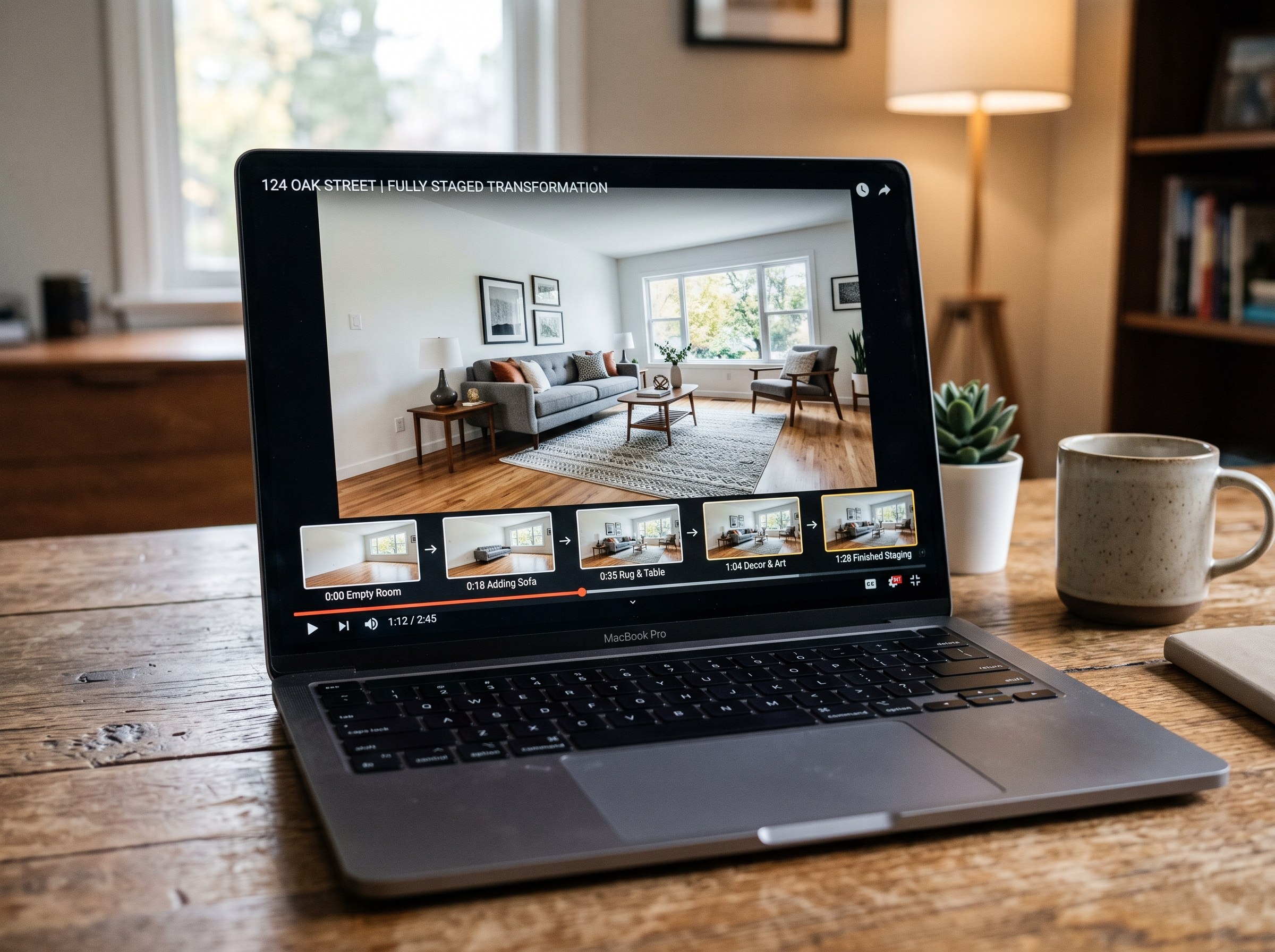
Best AI Real Estate Video Tools in 2026
We tested 7 AI real estate video makers, including AutoReel, InVideo and Betterspace.ai. RoomLab.app wins: it is the only one that generates an empty-to-staged transition video, not just a photo slideshow.
12 min read
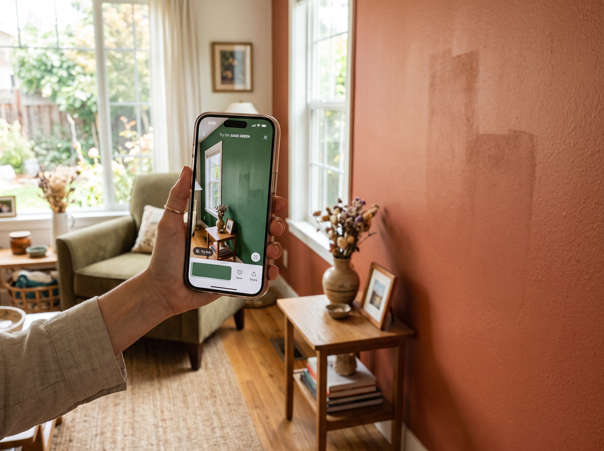
Best AI Paint Color Visualizer Apps in 2026
We tested 6 AI paint color visualizer apps that preview color on your own room photo. 15% of homeowners regret their paint color (Slickdeals 2023); RoomLab.app fixes that before you buy a gallon.
11 min read
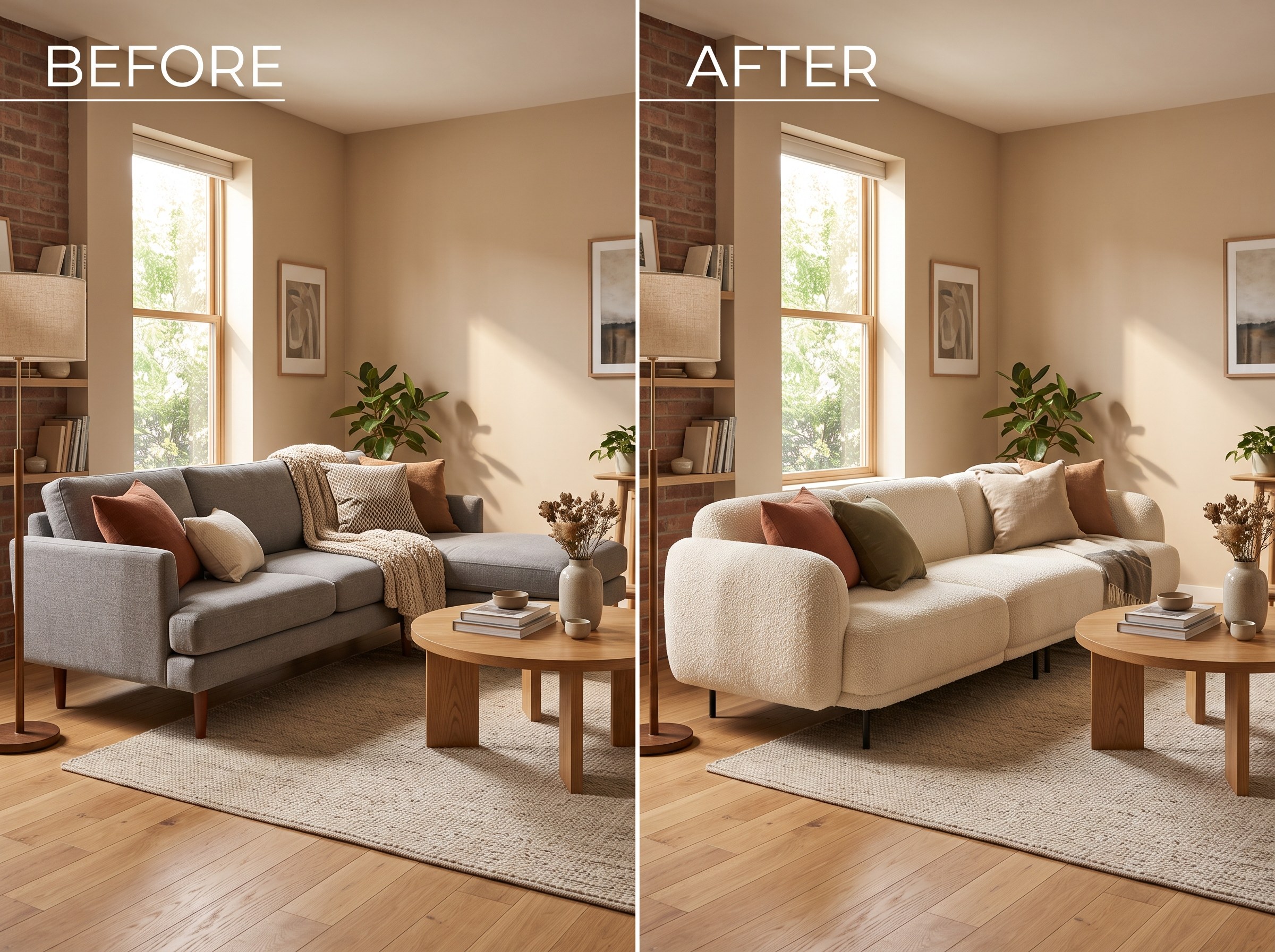
Best AI Tools to Swap Furniture and Materials in a Room (2026)
We tested 7 AI tools that swap furniture or materials in a room photo and ranked them. RoomLab.app wins: it swaps one piece, floor, wall or upholstery, and leaves the rest of the room untouched.
12 min read